Simplicity & clarity
Simplicity & clarity
Simplicity & clarity
Mubadala Investment Company
Mubadala Investment Company
Mubadala Investment Company
Mubadala as an investment corporation has issued annual reports for several years. We were tasked to create both a mircosite and brochure in English and Arabic to articulate and demonstrate the 2019 achievements and financials. We developed a creative and dynamic solution for both online and office platforms in order for the information to be told through the power of storytelling using visual and multi-media content.
Mubadala as an investment corporation has issued annual reports for several years. We were tasked to create both a mircosite and brochure in English and Arabic to articulate and demonstrate the 2019 achievements and financials. We developed a creative and dynamic solution for both online and office platforms in order for the information to be told through the power of storytelling using visual and multi-media content.
Mubadala as an investment corporation has issued annual reports for several years. We were tasked to create both a mircosite and brochure in English and Arabic to articulate and demonstrate the 2019 achievements and financials. We developed a creative and dynamic solution for both online and office platforms in order for the information to be told through the power of storytelling using visual and multi-media content.
WE PARTNERED IN
Microsite - English & Arabic, Brochure - English & Arabic
WE PARTNERED IN
Microsite - English & Arabic, Brochure - English & Arabic
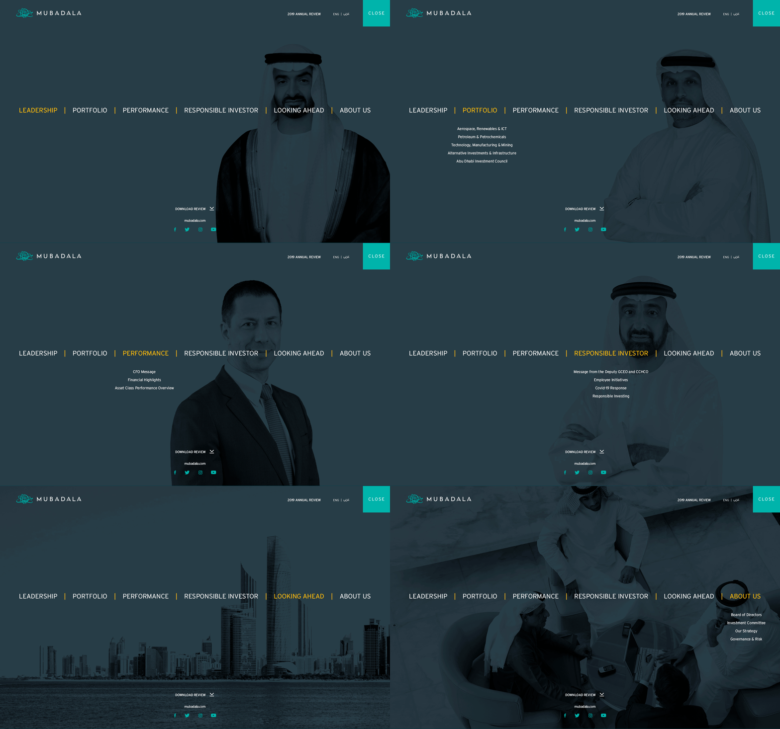
The ease of navigation and user ability was an integral part of the microsite from the get go. Once launched publicly, the general public and stakeholders were able to navigate to specific sections of the site through a full screen action menu that animated on mouseover.
The ease of navigation and user ability was an integral part of the microsite from the get go. Once launched publicly, the general public and stakeholders were able to navigate to specific sections of the site through a full screen action menu that animated on mouse over.
The ease of navigation and user ability was an integral part of the microsite from the get go. Once launched publicly, the general public and stakeholders were able to navigate to specific sections of the site through a full screen action menu that animated on mouse over.
The ease of navigation and user ability was an integral part of the microsite from the get go. Once launched publicly, the general public and stakeholders were able to navigate to specific sections of the site through a full screen action menu that animated on mouse over.
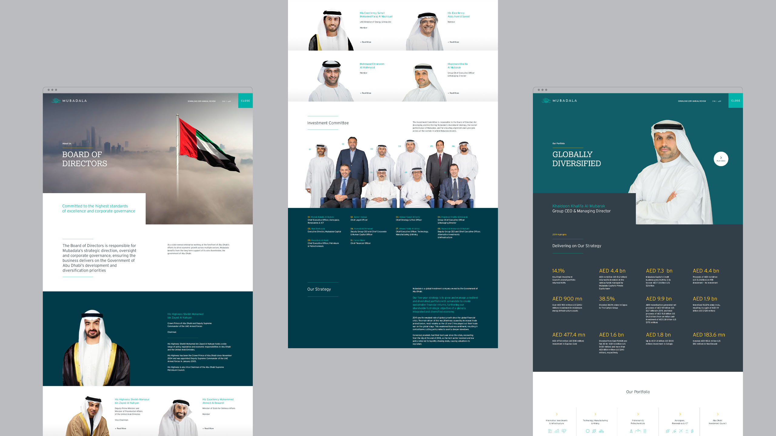
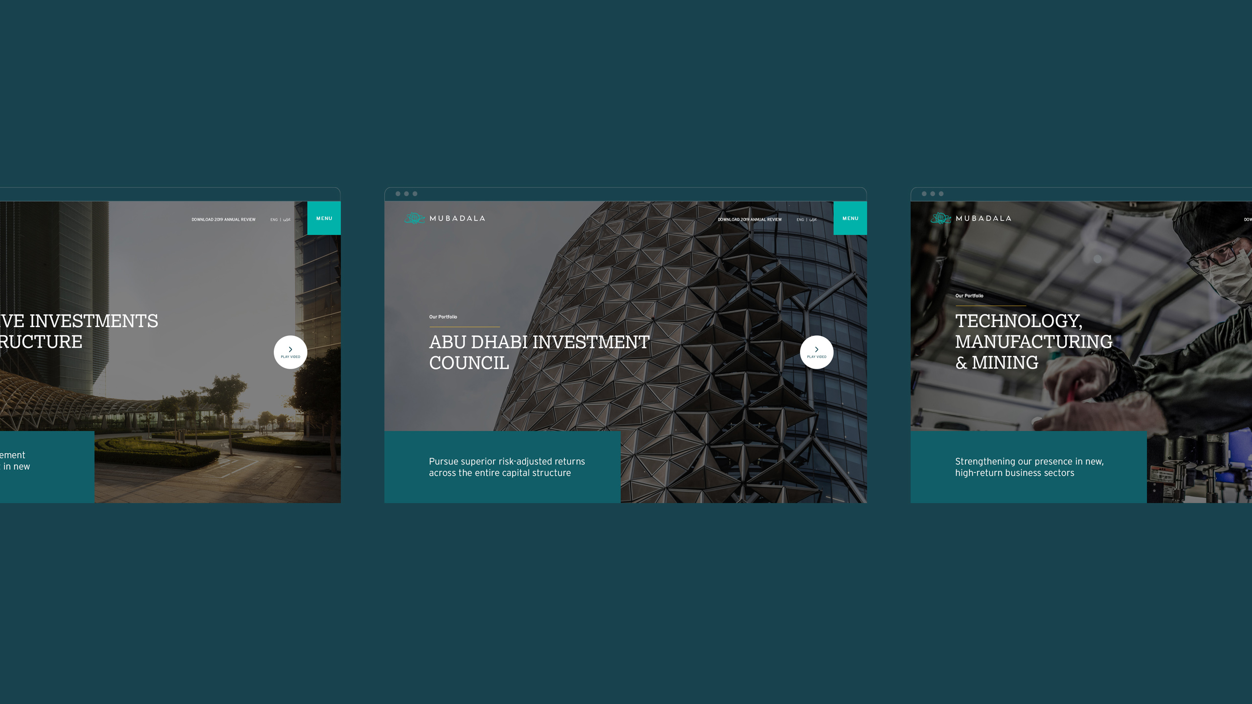
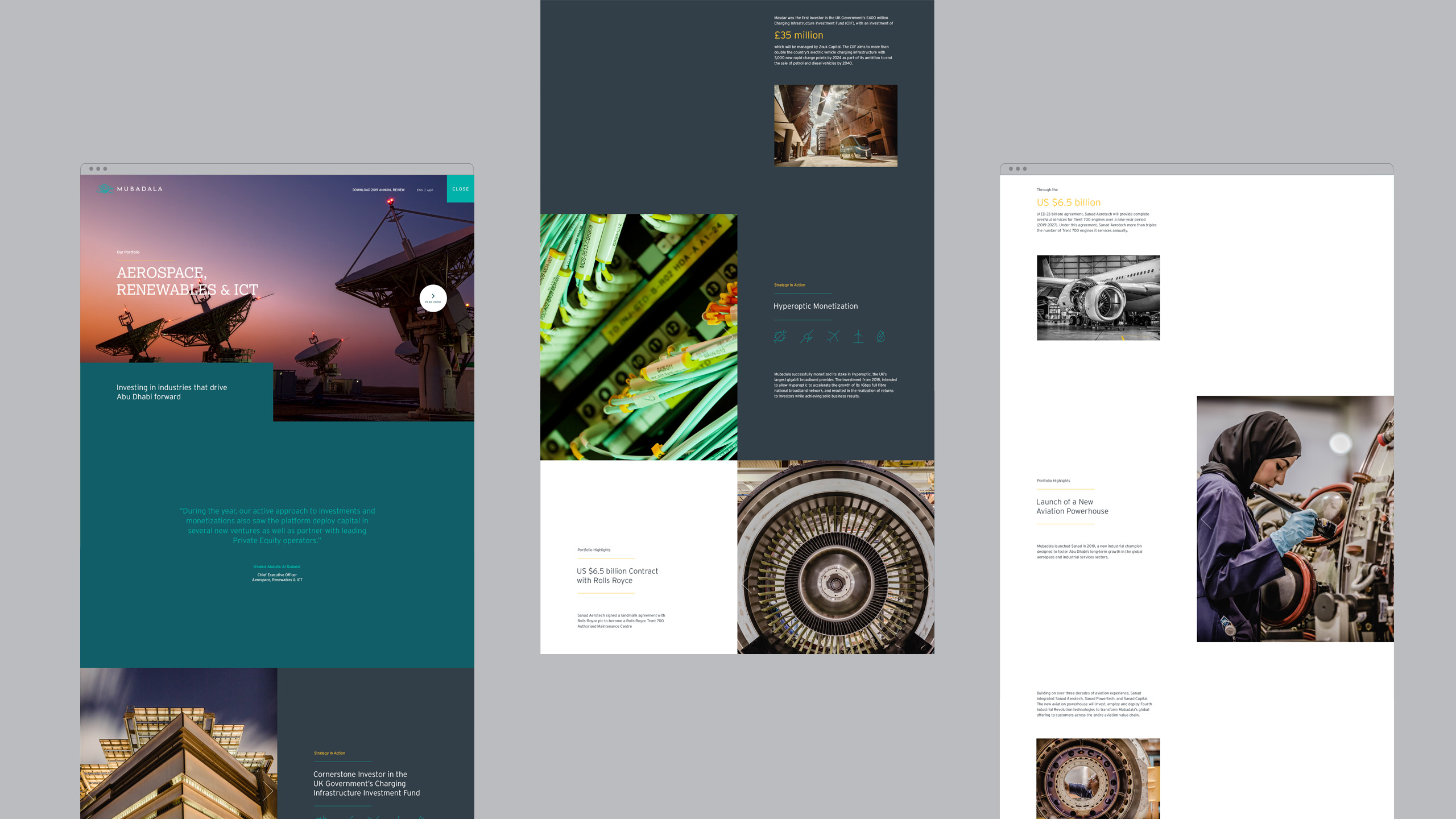
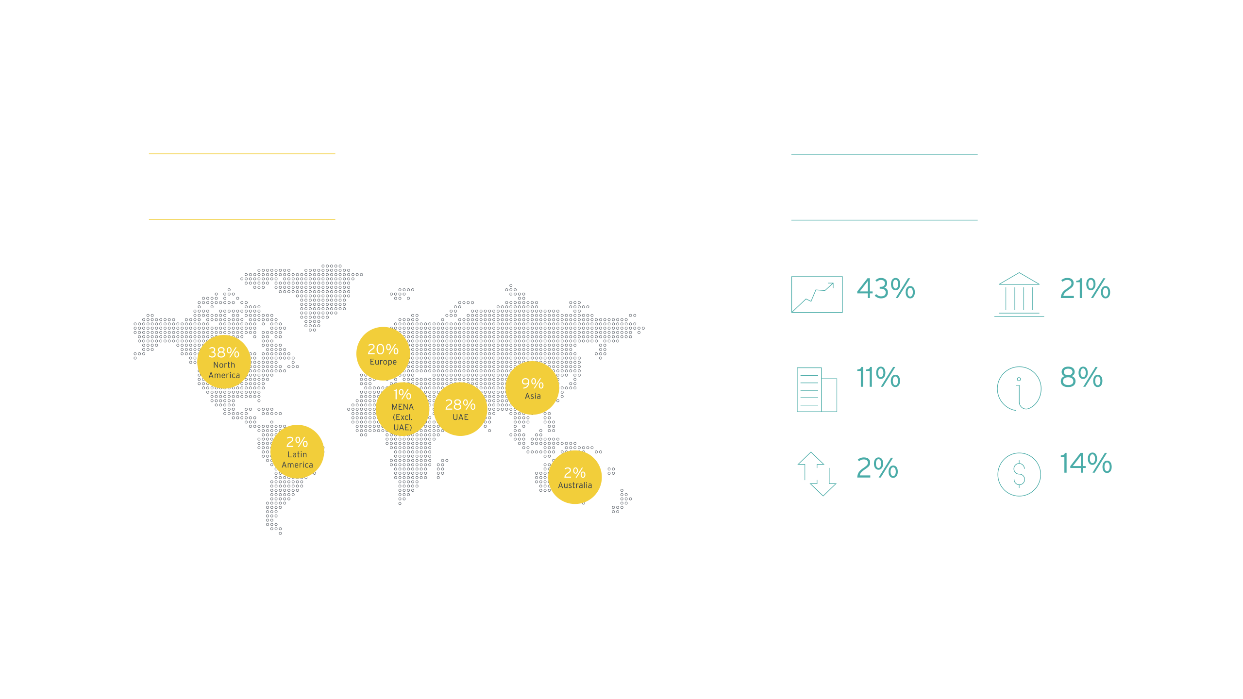
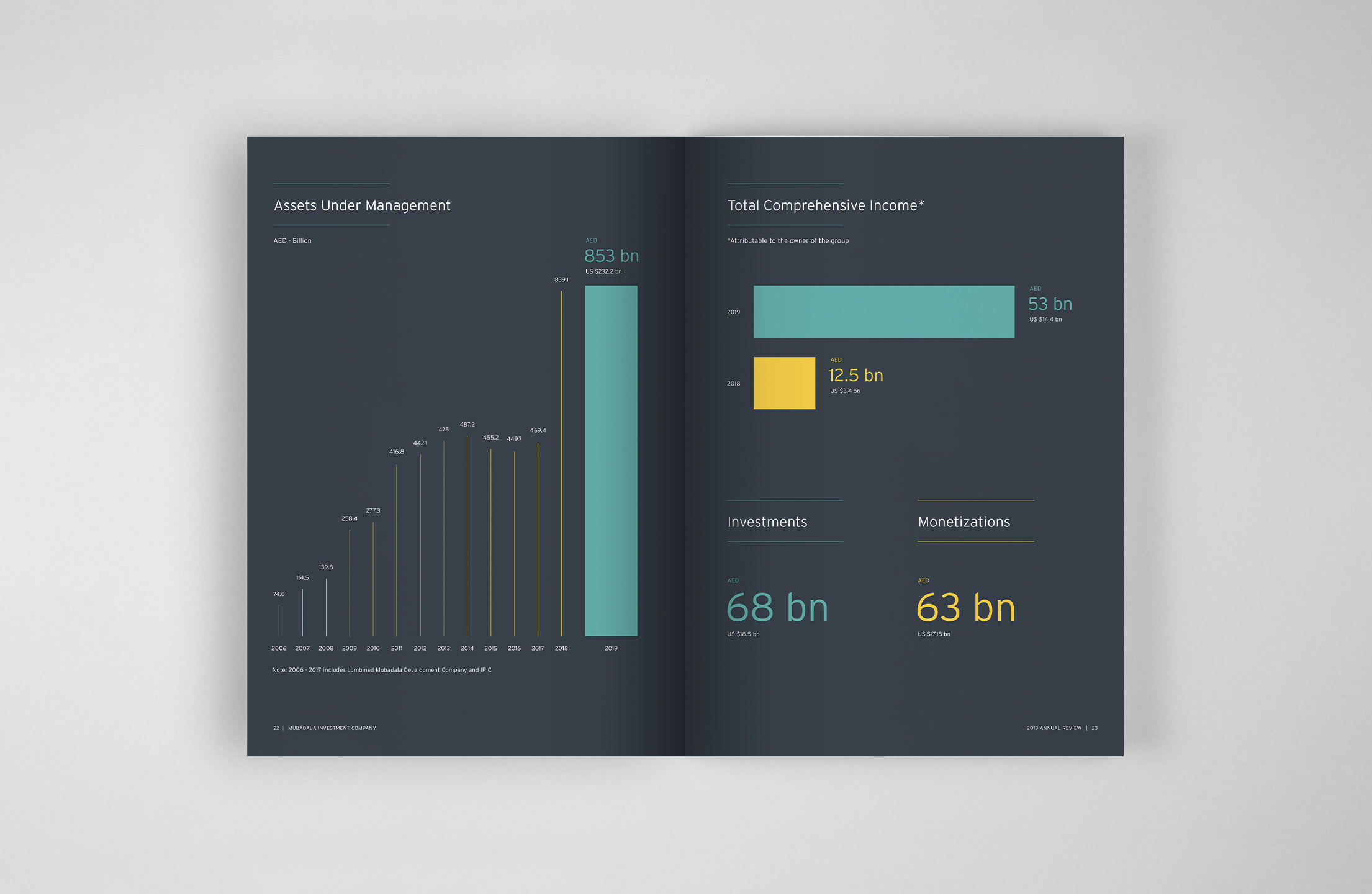
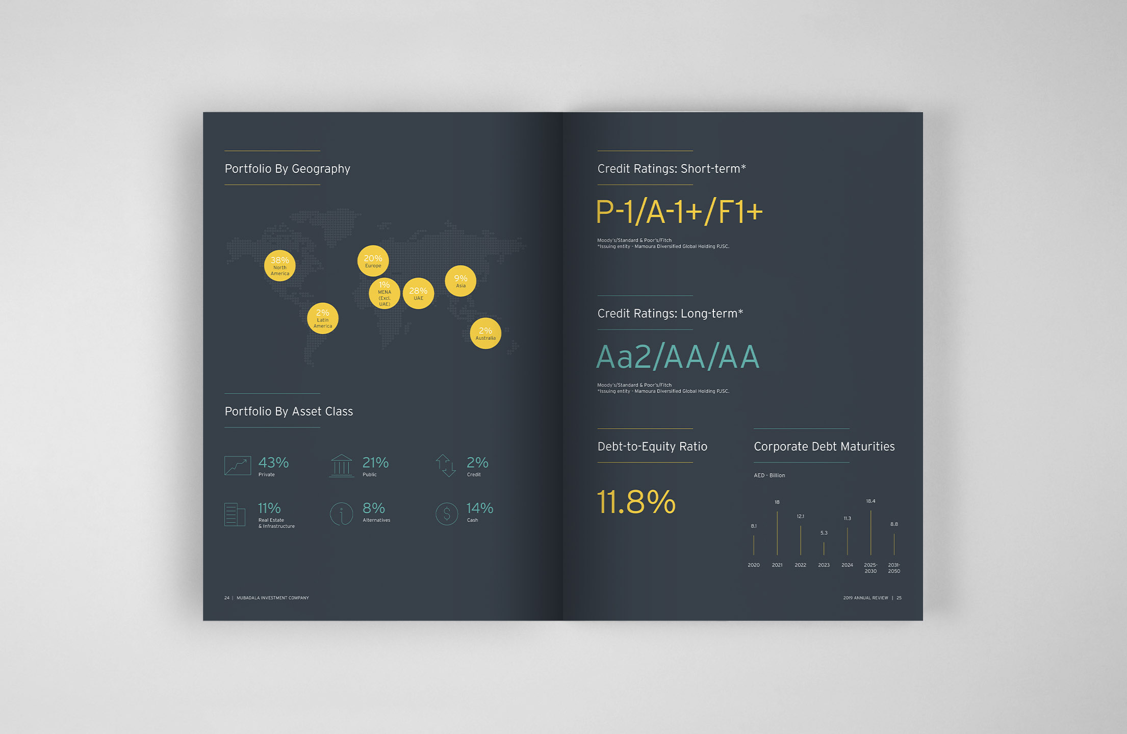
The financial section of the microsite needed to be engaging whilst being able to showcase the financial data and successes in a clean, slick and user-friendly manner. The data was developed to grow and increase as the user scrolled down the page therefore always putting the audience at the forefront of the functionality of the site.
The financial section of the microsite needed to be engaging whilst being able to showcase the financial data and successes in a clean, slick and user-friendly manner. The data was developed to grow and increase as the user scrolled down the page therefore always putting the audience at the forefront of the functionality of the site.
The financial section of the microsite needed to be engaging whilst being able to showcase the financial data and successes in a clean, slick and user-friendly manner. The data was developed to grow and increase as the user scrolled down the page therefore always putting the audience at the forefront of the functionality of the site.
The financial section of the microsite needed to be engaging whilst being able to showcase the financial data and successes in a clean, slick and user-friendly manner. The data was developed to grow and increase as the user scrolled down the page therefore always putting the audience at the forefront of the functionality of the site.
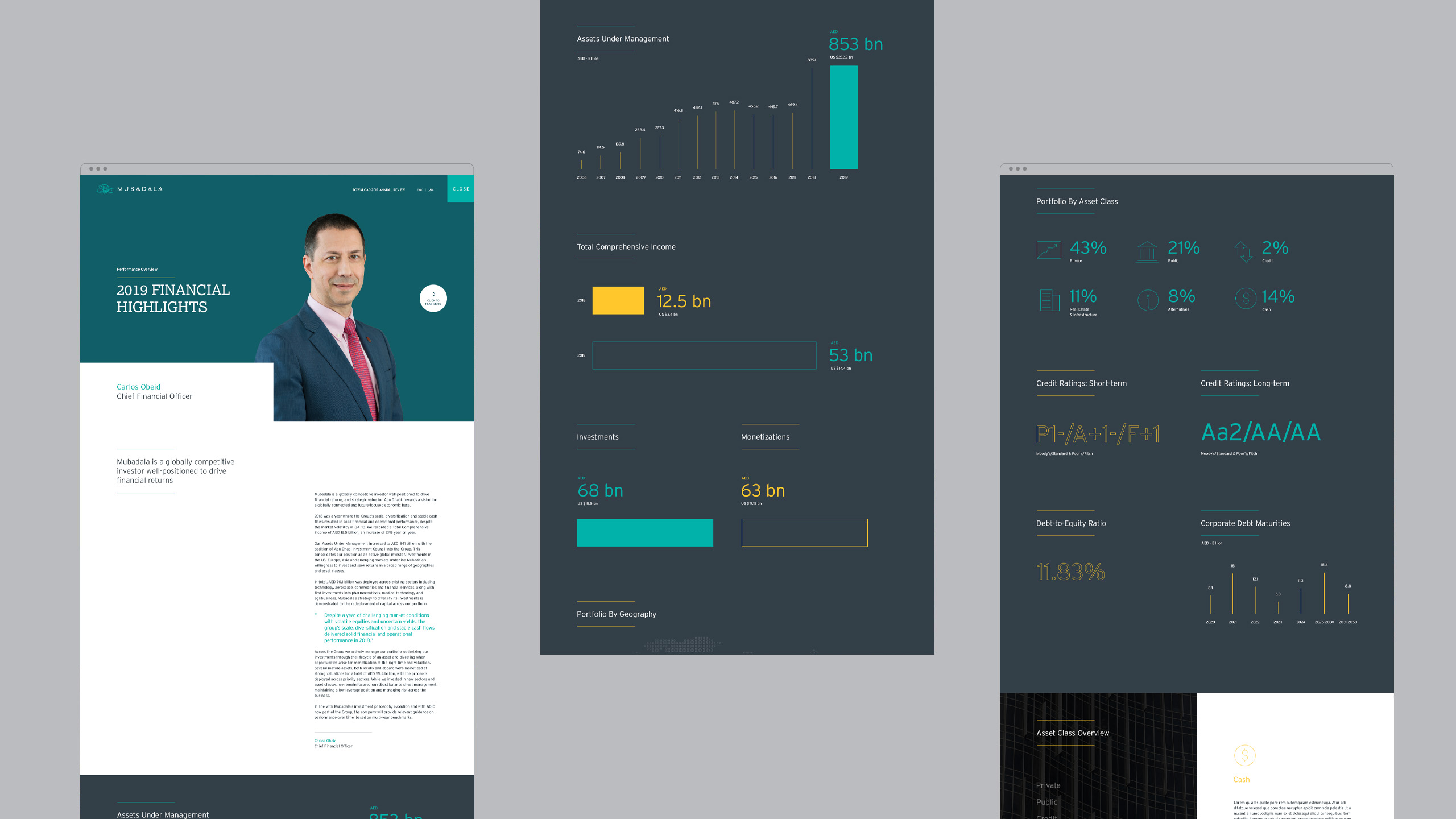
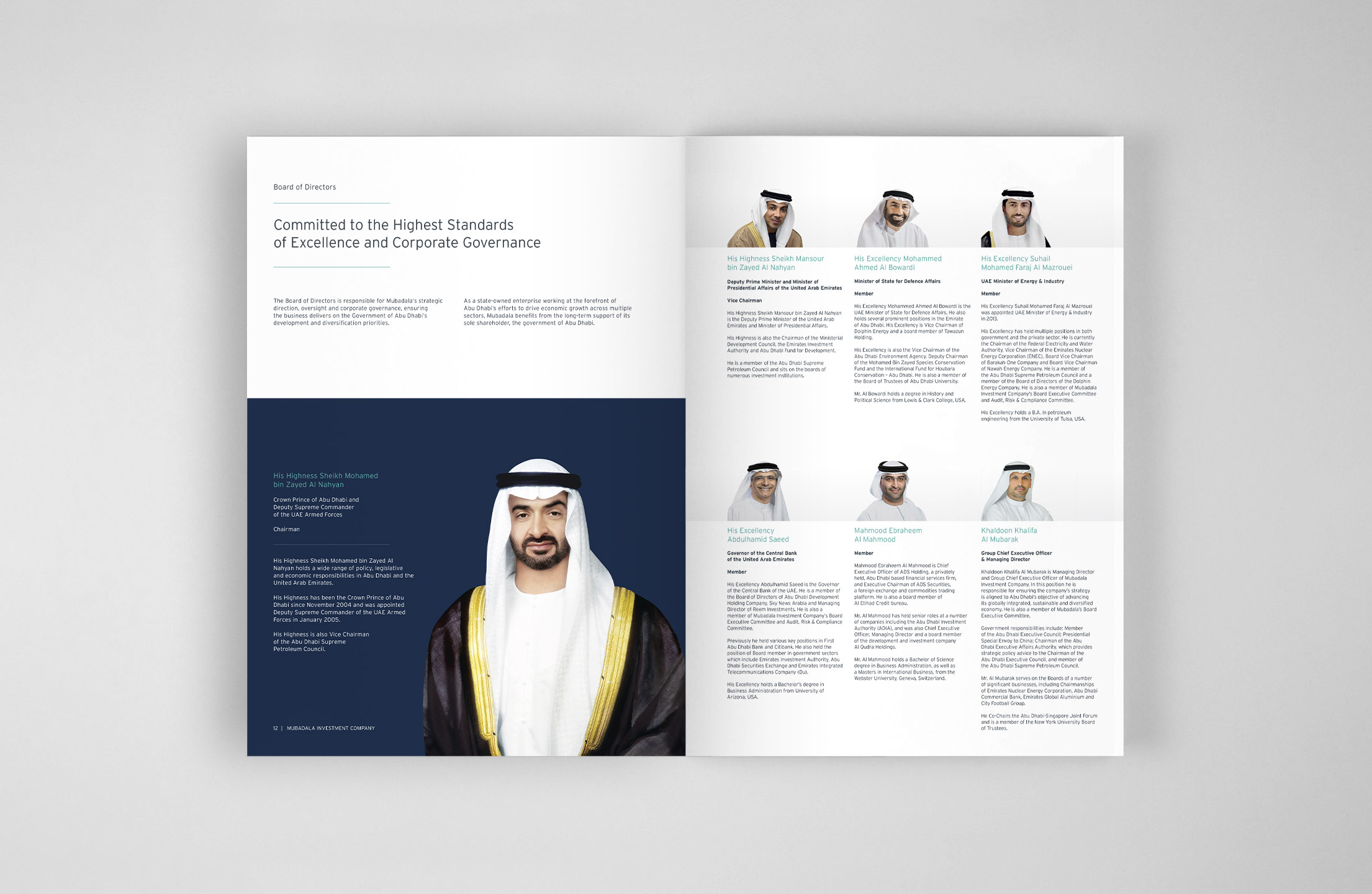
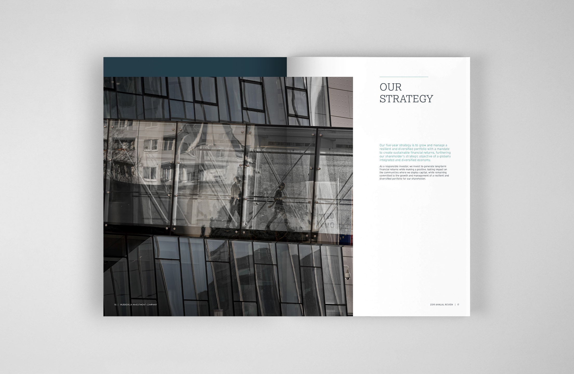
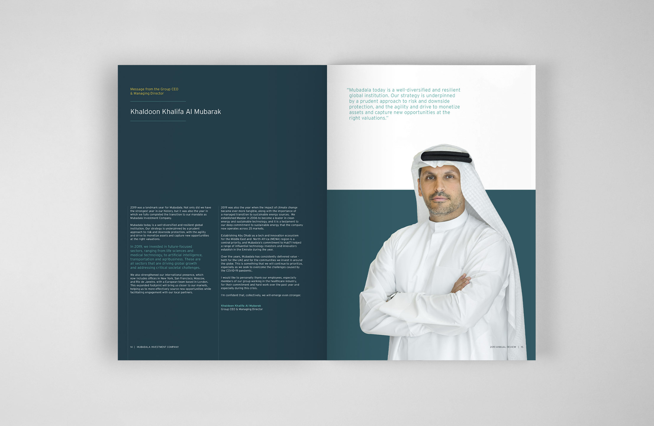
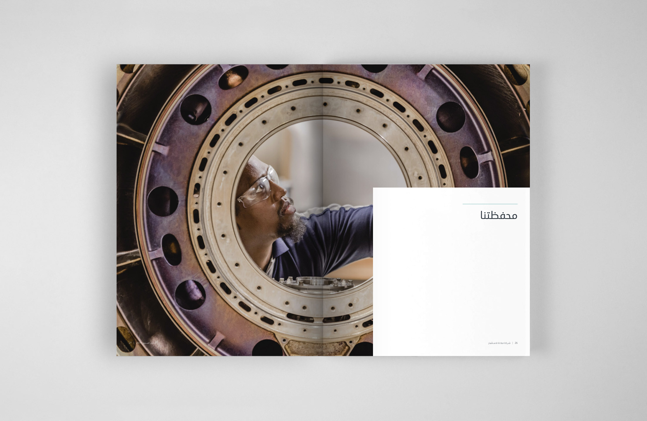
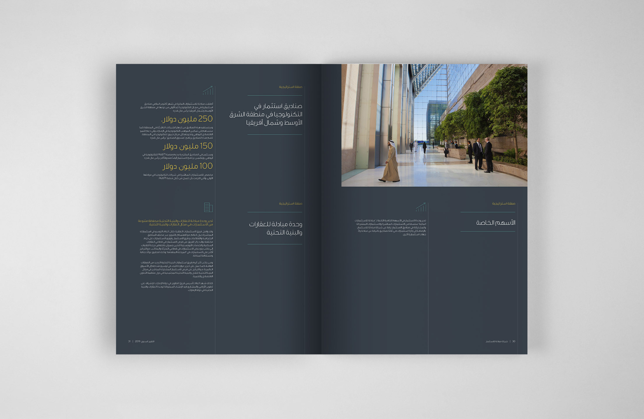
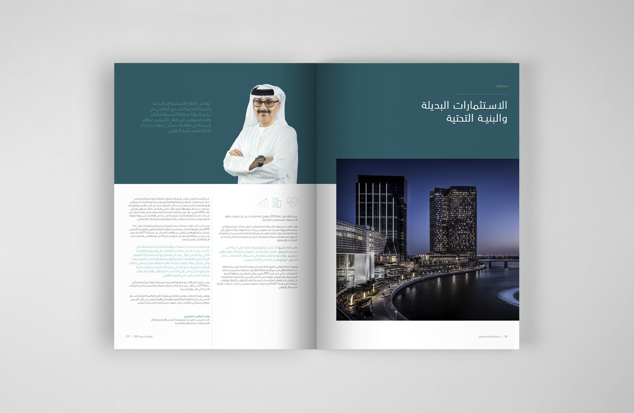
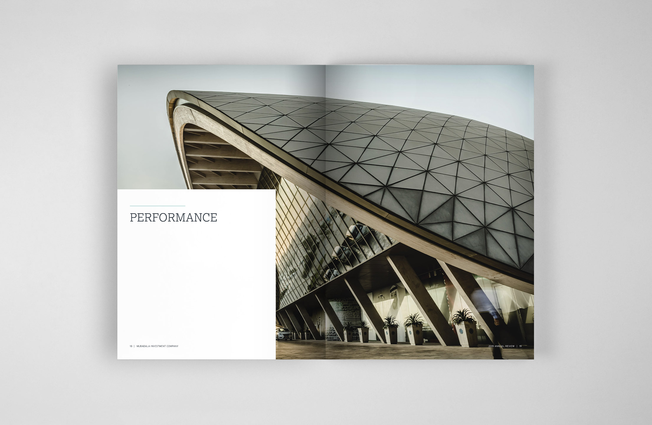
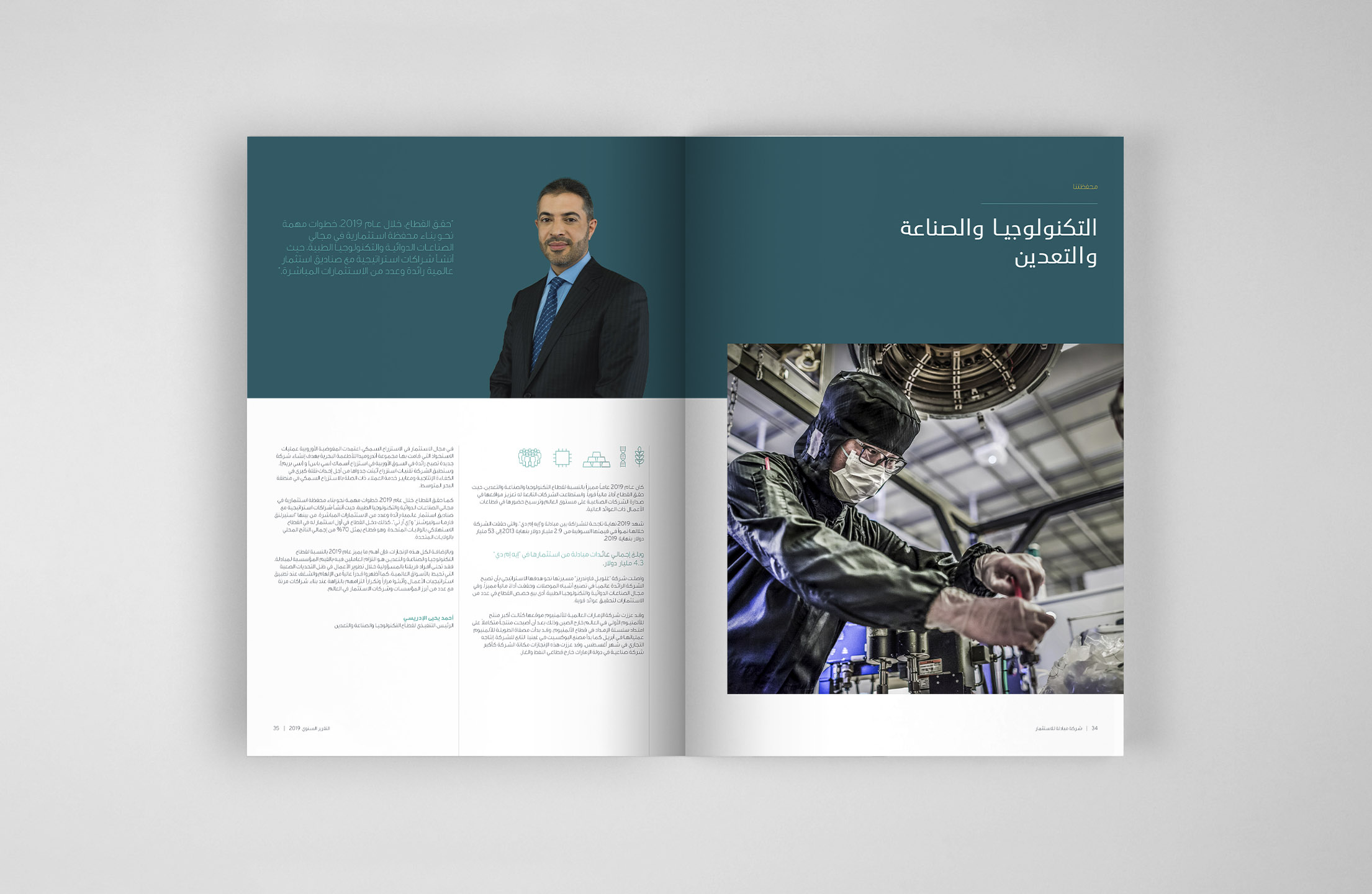
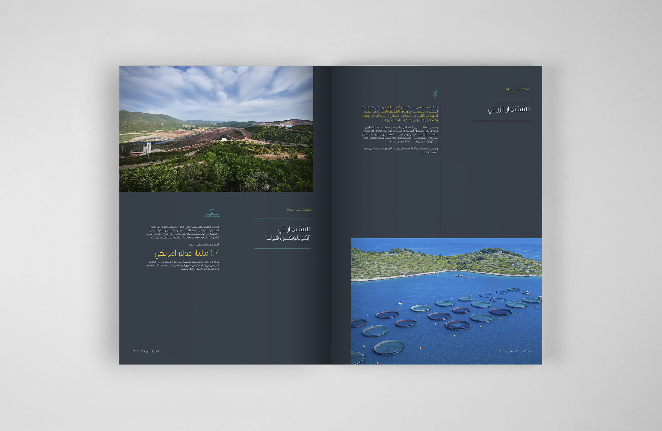
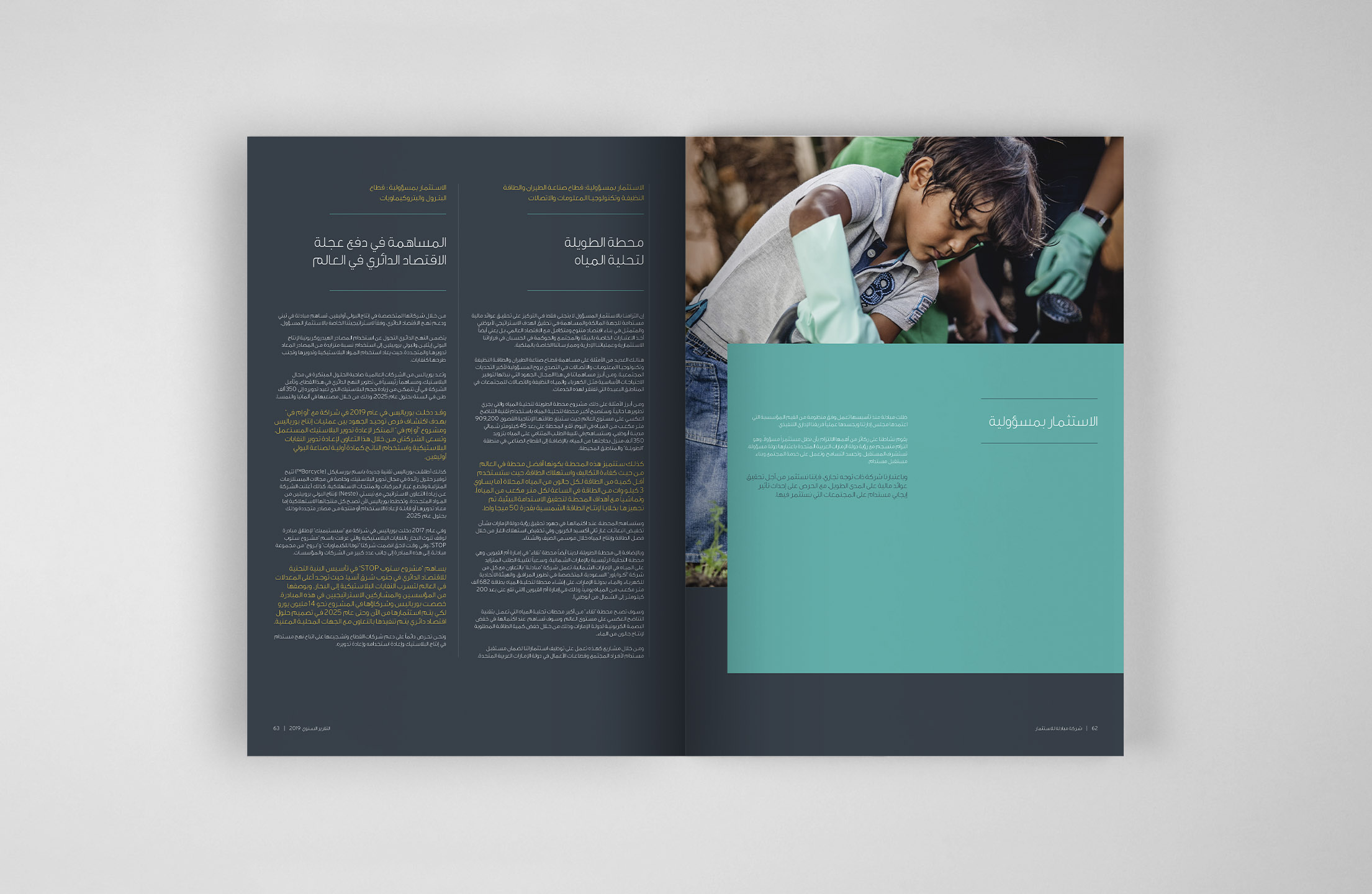
To support the microsite, a printed release of the Annual Review was required in an editorial feel to match the design and art direction of the microsite. There was an English and Arabic version and they were printed for the high-tier, regional stakeholders.
To support the microsite, a printed release of the Annual Review was required in an editorial feel to match the design and art direction of the microsite. There was an English and Arabic version and they were printed for the high-tier, regional stakeholders.
To support the microsite, a printed release of the Annual Review was required in an editorial feel to match the design and art direction of the microsite. There was an English and Arabic version and they were printed for the high-tier, regional stakeholders.
To support the microsite, a printed release of the Annual Review was required in an editorial feel to match the design and art direction of the microsite. There was an English and Arabic version and they were printed for the high-tier, regional stakeholders.
NEXT PROJECT
Next Up!
Next Up!
NEXT PROJECT


